AWS Aruba Mobile-First Web Design
Test to see if your website is mobile-friendly
Test to see if your website is mobile-friendly
Content becomes the priority in mobile-first web design. This design creates a hierarchy of content users need, use, and appreciate. Designing with restrictions and limitations forces the user experience designer to remove unnecessary elements and focus on the essential.
The mobile user visiting your website sometimes has different needs than your typical desktop user. Sometimes, but not always, a desktop user may be looking for more in-depth information or additional features that are more difficult to render on mobile.
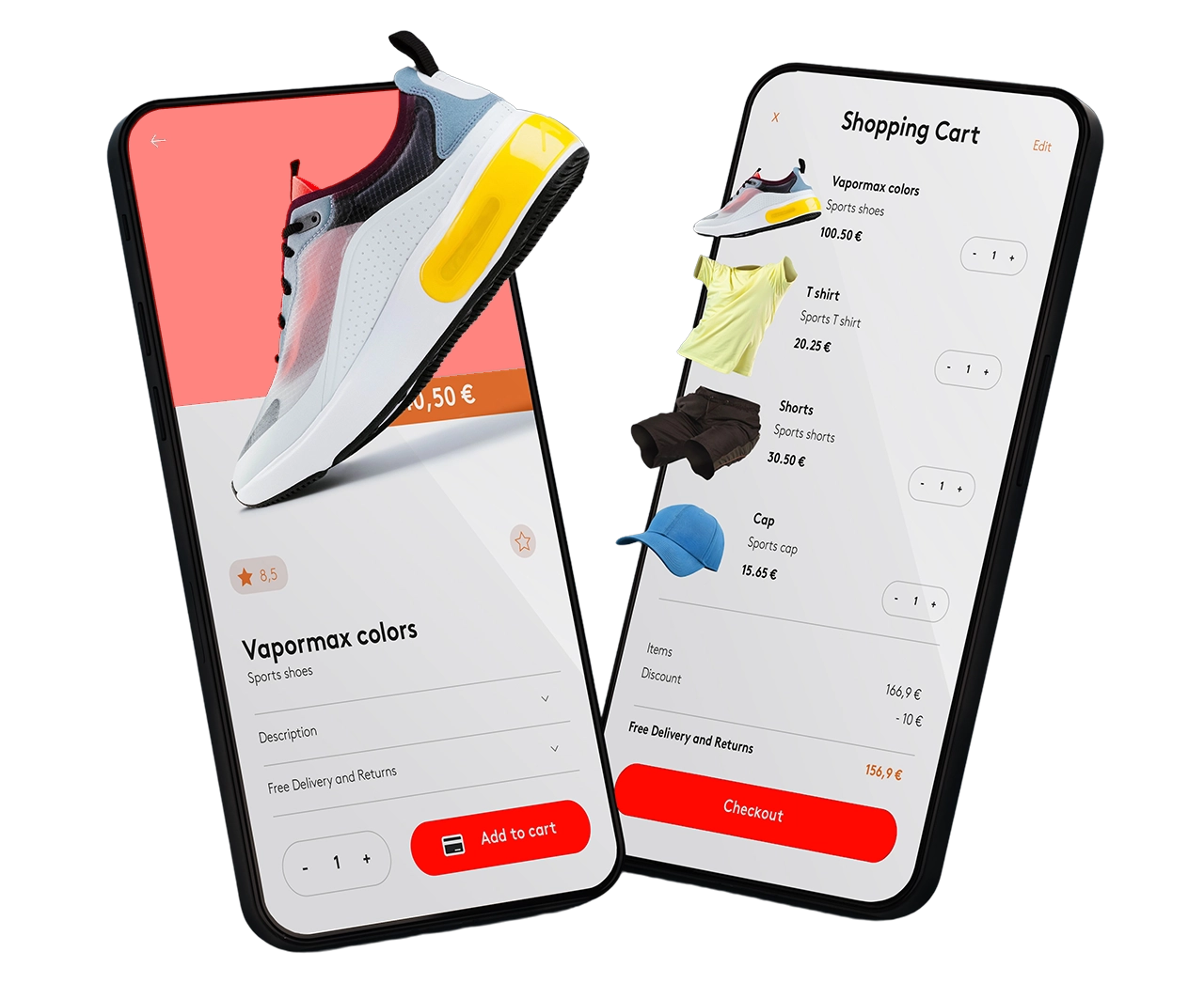
Chances are you are reading this on a mobile device. The sheer number of mobile internet users alone speaks volumes, especially when compared with the situation of years past. One thing you have to be aware of: Mobile design is far more than the good presentation of websites on smartphones. A Mobile-First Web Design is necessary if you want to stay relevant in 2021 and beyond.
Getting mobile-first right will significantly improve your brand perception and your mobile website user engagement. Those mean a more positive customer experience, more interaction, and more business. So here’s the question: Is your website mobile-friendly? Contact us for a free, no-obligation audit of your website, and we’ll let you know how mobile-friendly it is.
Professional web design and SEO experts based in Aruba. We'll design, optimize, and develop your perfect website. Don’t miss out. Take your site SEO game to a new level today!
Get in Touch ▶
💬+297 564 4076
📧seo@awsaruba.com
© 2026 ⟨Amazing Web Solutions Aruba⟩
Privacy | Terms